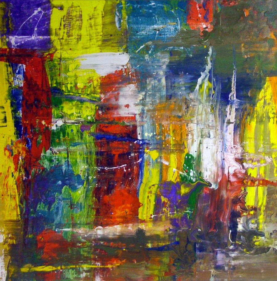
After the recent wave of drip paintings I have done both for the site and for private commissions I was overjoyed to let myself go and create a joyous celebration of colour that I have named ‘Carnival’.
Freely expressive applications of bright primary colours blend effortlessly with more complex hues and tones to produce a painting that is harmonious, balanced and very easy to get on with.
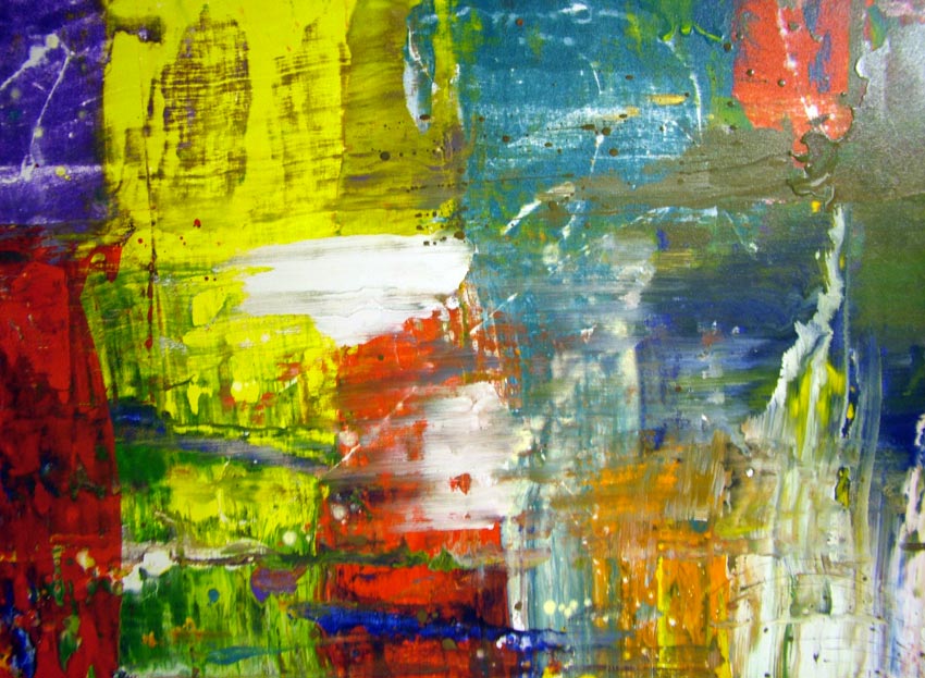
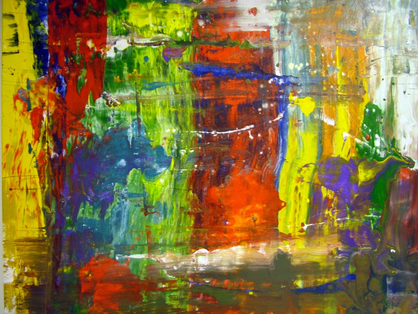
As is normal for me I painted carnival with enamel paints of various consistencies and in lots of different combinations. I also used a more heavier canvas cloth than I would normally have chosen as I wanted to get the fibres to show through in places as this gives a great earthy quality to the painting. I think it fits well with the overall coarseness of the applications. I never intended carnival to be a study of infinite detail and complexity – in fact it’s quite the opposite. Sometimes the simplest of ideas executed properly can produce really good results.
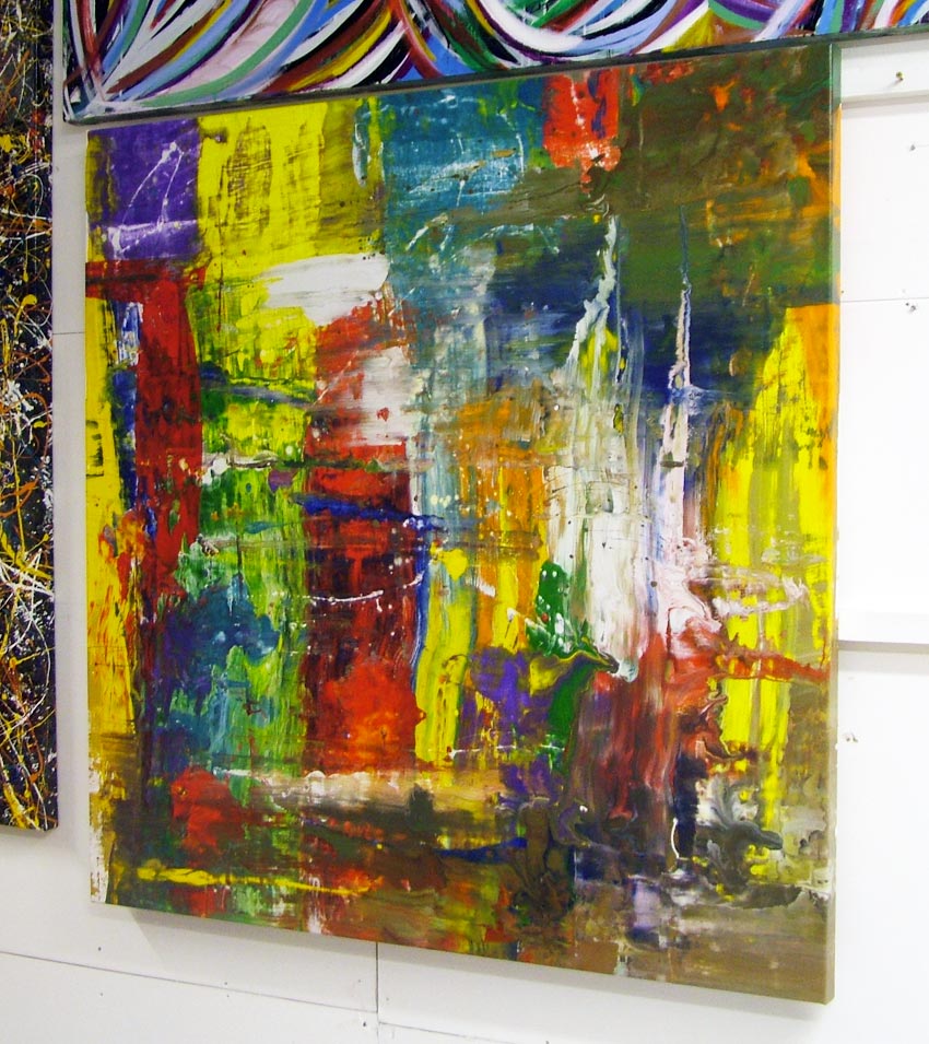
The balance of white is just enough to bring the painting to life yet still maintain a balance between the other colours that are all competing for your attention. This is a decent size piece too at 1.4 metres square so it’s going to really fill your space with colour.
This particular piece measures 1400mm x 1400mm x 47mm and was painted onto 12oz triple primed Belgian loose weaved canvas and stretched over a museum-grade kiln-dried hardwood frame by me. It was painted in ten shades of oil based enamel paint and a selection of thinning mediums.
The canvas was painted on the floor.
Carnival is ready to hang.